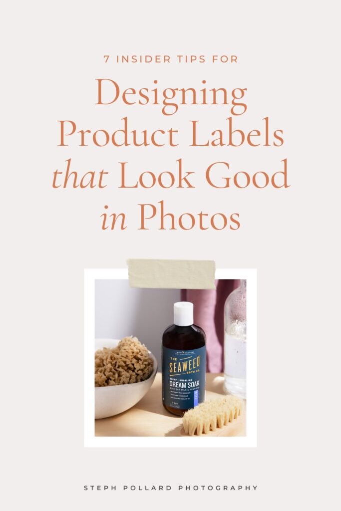
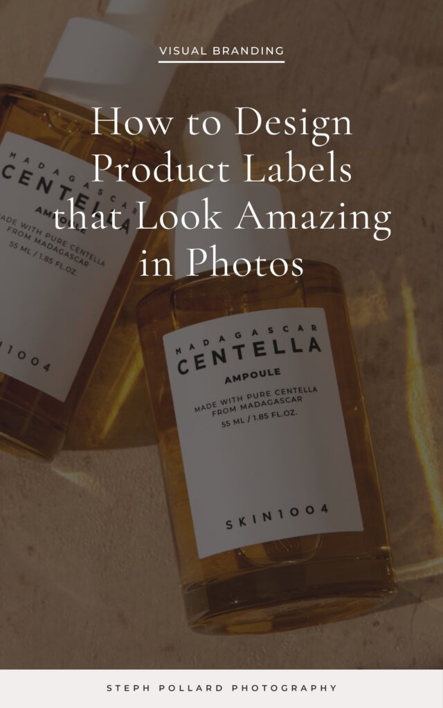
7 Insider Tips for Designing Product Labels that Look Amazing in Photos
filed in
If you’re starting an ecommerce business and you’re in the product design phase, listen up: it’s not too early to think about how your product is going to look in photos.
While you might think the brand design, packaging or even what’s inside the bottle is primo, I would actually say it’s the label. That’s because no amount of lighting know-how or Photoshop editing can make a not-so-great label look good in photos. And since 75% of online shoppers rely on product photos to make purchasing decisions [source], a poorly designed product label turns off potential customers right out of the gate.
I don’t want you to be that brand.
So here’s how to design product labels that look great in photos and convert more browsers into buyers.

How to Design Product Labels that Look Good in Photos
1 | Readability is Key
It’s fine if some aspects of your label can only be read up close (the item weight or fine print). But things like your brand name and product name should be visible from across the room and in various lighting conditions.
Make sure to use a large, bold font for the important bits and choose colors with adequate contrast when paired together.
2 | Leave Ample White Space
White spice is the empty space between different elements on your packaging.
A clean, uncluttered label looks better in photos because it draws the eye in and gives it a place to rest (which is exactly where you want it — on the product). White space also helps separate the various blocks of text on the label, making it easier to pick out the brand name and product name at first glance.
3 | Make Sure the Important Info Doesn’t Get Cut Off
You’d think this one goes without saying, but you’d be surprised how often I see product labels with text that gets cut off in photos. So… if your product is in a round bottle, keep the brand and product names centered on the front 40% of the bottle with plenty of white space on either side. That way, the camera can capture all the important details without anything getting cut off as it wraps around the sides.
4 | Stick to 2 Colors, 3 Max
Your label designer may have other ideas, but putting too many colors on a product label makes it hard to choose colors for your photoshoot. Either it will look too busy and chaotic or your prop colors will end up clashing with one of your product colors and the whole image will feel off.
5 | Avoid Highly Reflective Finishes
Any product photographer will tell you that reflective labels are a beast to photograph. They show fingerprints, wrinkles and blemishes, often have hotspots that bounce too much light, and reflect unwanted colors.
And while a good photographer can make it work, it takes a ton of time in both production and post-production to make glossy labels look right—which means more time and money out of your pocket.
6 | Skip the Thin or Ornate Fonts
Camera sensors don’t have as many receptors as the human eye, therefore fonts that look good on the computer and in real life may not look good in the camera. This is especially true with uneven lighting, which can lead to shadows and highlights that obscure the fonts and make them appear washed out.
When designing product labels, skip the thin, wispy and ornate fonts that often get lost in the final image.
7 | Test Your Colors Before Committing
Some colors may appear differently in print or under certain lighting conditions, so you want to test them out in the wild before committing to a full print run.
For example, if you have a sunscreen brand and plan to take a bunch of pictures of your product at the beach, order a packaging sample and snap a few test shots at the beach. I recommend doing this with both a phone and an actual camera to cover your bases. Although a professional photographer can adjust colors in post-production, UGC creators often cannot.
Looking for a product photographer who can help you convert browsers into raving fans? Click here to learn more about my services.
